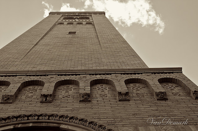
Today, let's time travel backwards a couple months....
to a trip.....
to a college town.
As I wandered around the town,
I captured architectural details.
Sepia seemed to suit these glimpses of amazing art
and craftsmanship from the past.
Wishing you a happy and creative week!


Gorgeous architectural details. Love your 'sepia' renderings!
ReplyDeleteI would agree...these looks great in sepia!
ReplyDeleteWonderful tone of the photos. Lovely details. Great architecture too. Gorgeous !
ReplyDeleteAnna, I am looking at all of those little lines on the columns in the second photograph, and am totally in awe. The architecture is just amazing, and your photographs of it are wonderful. I think your choice of sepia was perfect for these.
ReplyDeleteThank you so much for sharing at The Creative Exchange today.
Have a wonderful day!
lisa.
You've captured the detail powerfully.
ReplyDeleteI love all the architectural details you have captured here!
ReplyDeleteHow lovely, Anna. I admire great architecture and it's so nice to see it photographed lovingly. :)
ReplyDeleteBeautiful photos!
ReplyDeleteBeautiful details! The sepia really highlights the textures and carvings.
ReplyDeletesuch details are great for sepia treatment. :)
ReplyDeletebeautiful shots. you captured such wonderful detail.
ReplyDeleteGorgeous - the architectural details are amazing and the composition of your photos are beautiful.
ReplyDeleteooh, I agree, sepia works fine. these photos are very rich - with life, art, and detail. my fave (I always do have one you know) is the third one down. it's difficult to even imagine the making of this building and all the detail that went into it. the craftspeople who constructed it must have loved standing back, admiring their work when it was finished. simply lovely Anna. happy week to you.
ReplyDeleteYou have such an eye for finding intricacies that I'm sure so many people don't even give a second glance at.
ReplyDeleteThese really are gorgeous shots, and the textures are wonderful. I think the sepia really shows them off to advantage.
ReplyDeleteWonderful images, I love the detail in stone
ReplyDeleteAnna, these are stunning. The sepia tones really bring out the beauty of the stonework. Love it.
ReplyDeletexo
lynn
The tones really add such a great feel to all of your stunning photos. Thank you for sharing! I have a link up for altered tone photos (black and white, sepia, etc) that I would love if you joined.
ReplyDeleteWonderful sepia tones. The lack of color really brings out the details.
ReplyDeleteSepia: the perfect choice! Well done!!
ReplyDeleteThe sepia is perfect! Great textures. You remind me I should do a photowalk over at the campus here in town, a place I hadn't considered before. Thanks so much for linking in your texture to Exploring with a Camera!
ReplyDeleteGreat textured photos! Love the sepia tone! ~~ namaste, Carol ^_^ (A Creative Harbor) linked w/Exploring w/Cam
ReplyDeleteDear Anna perfect choice!I love the detail in stone!
ReplyDeleteHugs Monica
Each one absolutely gorgeous - love the sepia treatment; so perfect for these old stones.
ReplyDeleteGreat textures on this building!
ReplyDeleteGreat shots, love the textures and the sepia. You've really inspired me to go out and try some architectural photography. :)
ReplyDeleteI love these details, Anna! And the sepia treatment is just the thing for them. Somehow they are even more dramatic that way. Beautiful!
ReplyDeleteSepia is perfect for these photos and they are so crisp and artfully composed.
ReplyDeletebeautiful sepia.
ReplyDeletexo